Colors are incredibly important to decide on before remodeling. Creating a home color palette helps by keeping you within good design principles and ensures that the look of your home is creative and consistent. But how do you come up with a good color layout? Today we’ll show you how a color scheme is made, some sources you can take inspiration from, and how to practically apply your color scheme.
Why Get A Color Scheme?
Why is a color scheme so important in the first place? Why can’t we just plaster our favorite color over everything? Why not paint everything white, and not worry about a color scheme? A good palette is important for avoiding an eye-straining amount of color, while still creating visual interest. It will allow you to strike the perfect balance every time.
The 60-30-10 Rule
A good way to create a home color palette is to use the 60-30-10 rule. This consists of a dominant color that occupies 60% of the space, a secondary and complimentary color which takes up 30%, and an accent color for the remainder.
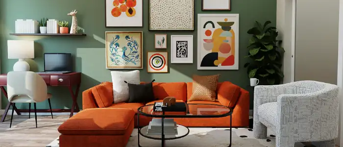
Your dominant color should not be too vibrant. White, grey, or another simple color can do well for this. It’s important not to pick a powerful color, as it can oversaturate a room. A dominate color is most often used for walls, ceilings and floors. A secondary color on the other hand, can be used for couches or other large furniture, and it should be more powerful than the dominate color. Lamps, pillows or other small furnishings can be a third, accent color, helping create extra visual interest.
Using A Color Wheel
A color wheel is a diagram invented by sir Isaac Newton in the 17th century. It’s been a staple of color design since, and it can help us in creating a home color palette.

It includes primary, secondary and tertiary colors
Complementary Colors
The color wheel maps out which colors are similar, and which contrast. For example red and cyan, located on the top and bottom of the diagram, are complementary colors. Combining these colors can lead to a more vibrant living space. This can be combined with the 60-30-10 rule, where a secondary and accent can be made complements to increase contrast.

Analogous Colors
Analogous colors, on the other hand, tend to blend together. Combining colors like red, red-Violet, and orange can make a space feel softer and more cohesive. An analogous color combination can include any amount of colors.
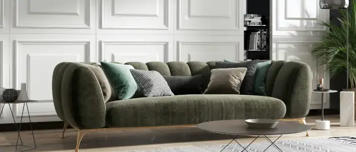
Note that the color wheel, and the 60-30-10 rule are two tools that can be used in conjunction, but don’t have to be. Analogous colors can be hard to use with the 60-30-10 rule in the same way as complementary colors. The most important part about the 60-30-10 rule is moderating your color usage, which is something you can do with any amount of colors, not just 3. You don’t need to strictly follow the proportions of 60% – 30% – 10% either, just be sparing with your strongest colors.
Monochromatic Colors
You can also avoid using multiple colors altogether. Only using one color, combined with black and/or white, is another effective strategy for creating a home color palette. Such a color scheme is called monochromatic, and is great for creating a cohesive feel, much like analogous colors.
Split Complementary Colors
One variation on complementary colors is called split complementary colors. Instead of using a color and it’s complement, it uses the colors analogous to the complement. For example, Instead of cyan and red, you would use cyan, orange, and red-violet.
Split complements are a great way to increase the number of colors in a palette while maintaining high contrast between them. It can provide the advantages of analogous and complementary color schemes.

Shades, Tints and Tones
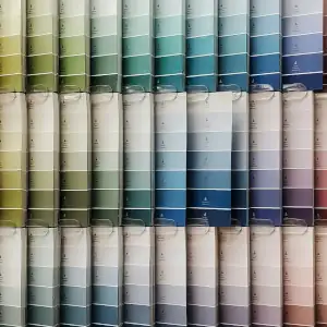
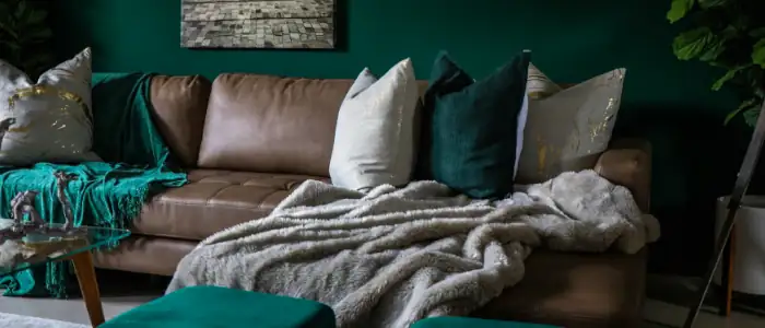
It’s important to note that using pure colors-as shown on the color wheel-can be immodest, and straining on the eyes. Using lighter versions of colors, called tints, can help reign in these pure colors. There are also shades, darker versions of colors, and tones, less saturated versions of colors. These can all help keep spaces modest, and pleasing to the eyes.
It’s a great idea to use shades, tints, and tones in combination with the 60-30-10 rule. The 60% color should be fairly easy on the eyes, thus using a light tint is best, whereas the 10% color should be strong and vibrant.
It’s also important to know whether to use a tint, shade, or tone. Ultimately, it’s up to what kind of atmosphere you want to create. Light tints, for instance, contribute to a clear, bright, breathable atmosphere, while dark shades may be warmer, and cozier.
Taking Inspiration
It’s great to take inspiration for your color designs as well. Magazines, online galleries, and other examples are great to pull from. You can also visit the homes of friends and family to borrow ideas. Another strategy is to consider what mood you want your home to have, and work from there. Blues, for instance, can be seen as cool and passive, while reds are warm and passionate.
There’s a whole world of color design to explore and experiment with. We hope this article equipped you with the basics so that you can create a home color palette to guide your remodel!


